Concept for a restaurant ordering app with a very complex level of customization
This was inspired in part by the June 2019 Adobe XD Design Challenge, which was for a food delivery app.
As I was thinking more about the food ordering user experience, I started to think about the restaurants I frequent. Many of those places offer super-customizable meals: for example, half-chicken half-vegetable rice bowls, extra sauces, extra vegetables, etc.
The possibilities are endless, in the restaurant. If I order from one of these places online for pick-up, however, I cannot get the same extra customization that I would get when in the restaurant. The apps don't really allow for too much customization, sometimes they just offer a "notes" field, and if they're really busy, sometimes those notes get missed.
I thought that this would be an interesting UX challenge, so I created this concept.
Wireframes
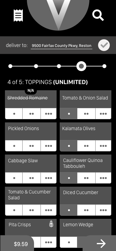
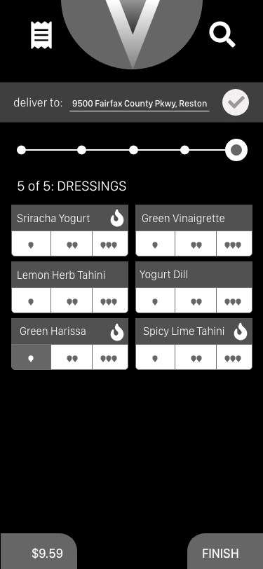
From sketching and wireframing I could easily tell that a complex level of customization could lead to a busy and overwhelming UX, as these early wireframes for an ordering wizard show:
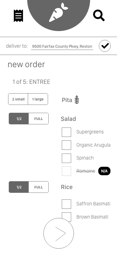
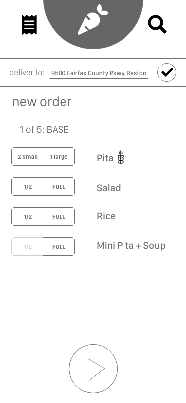
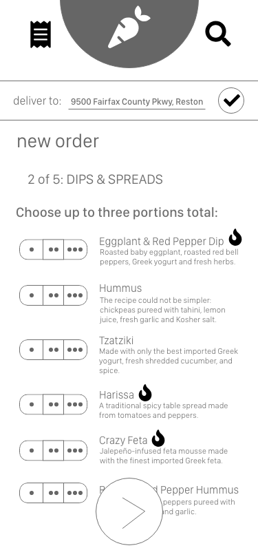
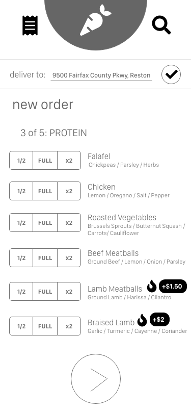
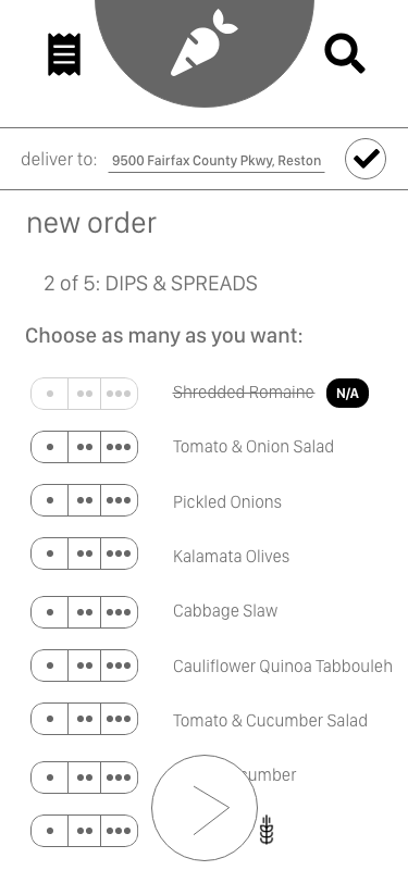
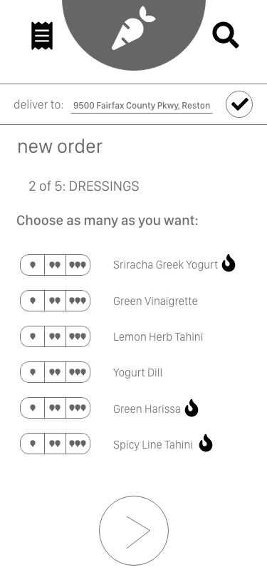
These got overwhelming because not only did I have the buttons for customizations, but I also had to include information important to customers, such as allergens, spiciness, extra charges, and if something was sold out.
User Interface
I organized this content with a card-based solution, which was a better visual way to show that much data. I also added a step counter near the top and buttons on the bottom for next steps and to track order pricing:
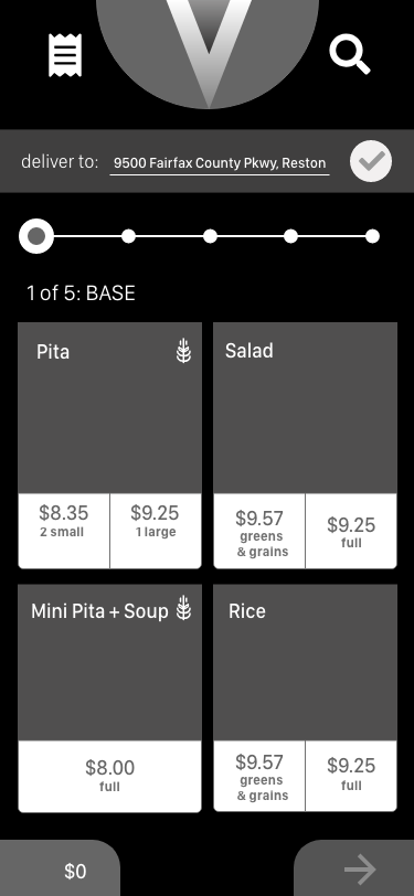
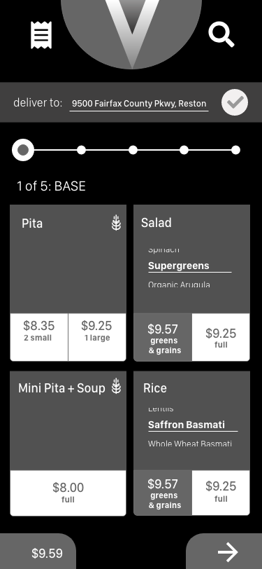
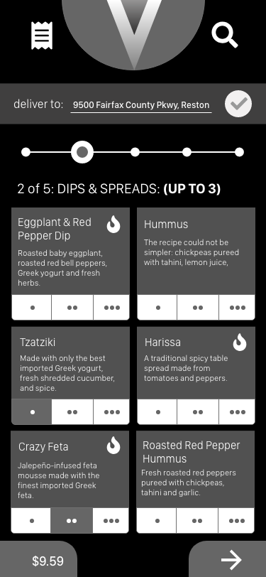
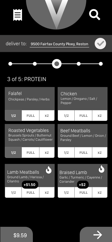
Final User Interface
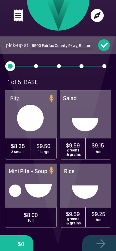
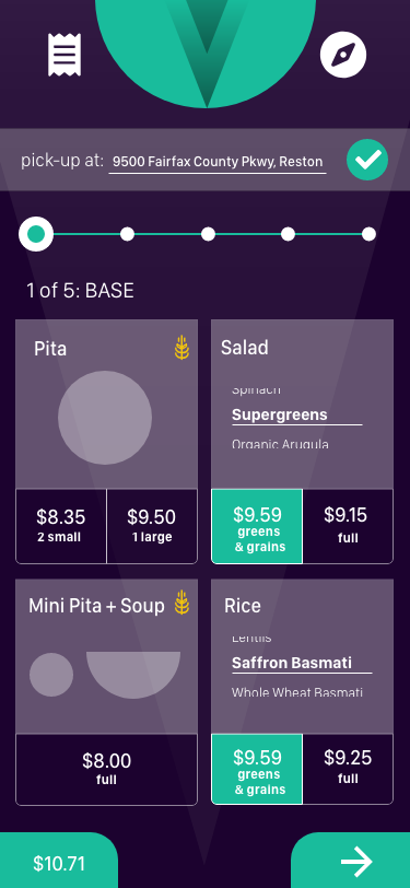
When it came to choosing colors, I went for a dark purple and a light green theme. I also toned down the customization buttons and added iconography to the beginning of the ordering process to help customers better find their favorites:
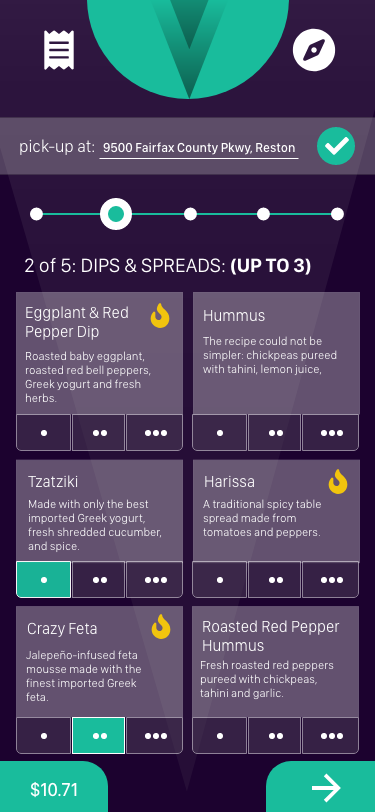
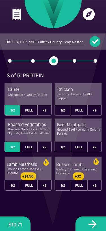
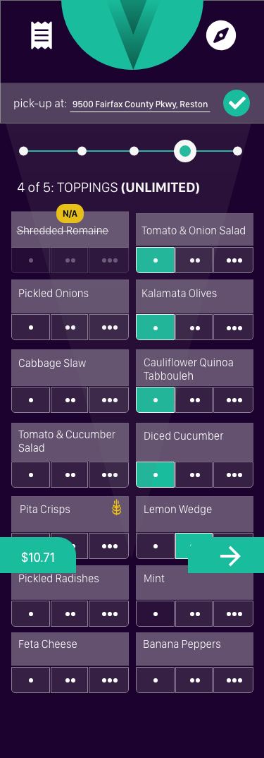
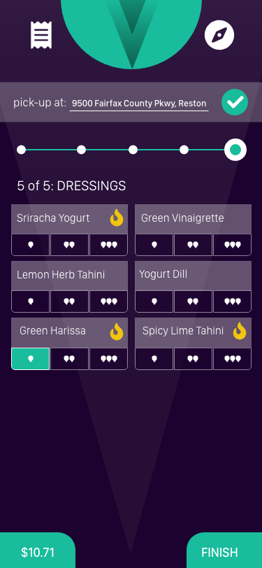
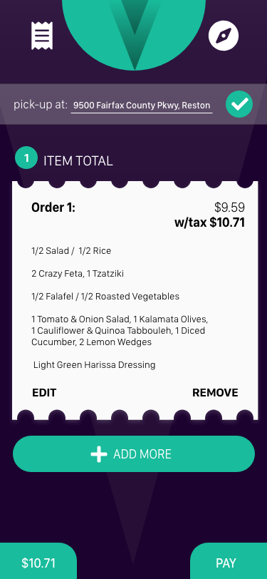
The final prototype can be found here and embedded below:


