Skills: OOUX, ORCA, usability as branding
How to use OOUX to make sense of the mess.
Issue:
I was doing a lunch-and-learn presentation on Object-oriented UX. Object-Oriented UX, also known as OOUX, is a UX process that unwraps complexity by way of focusing navigation elements as easy-to-recognize nouns, in keeping with how brains learn and work.
Since I had a recent bad experience ordering online at Taco Bell, I took an afternoon to redesign their online ordering experience.
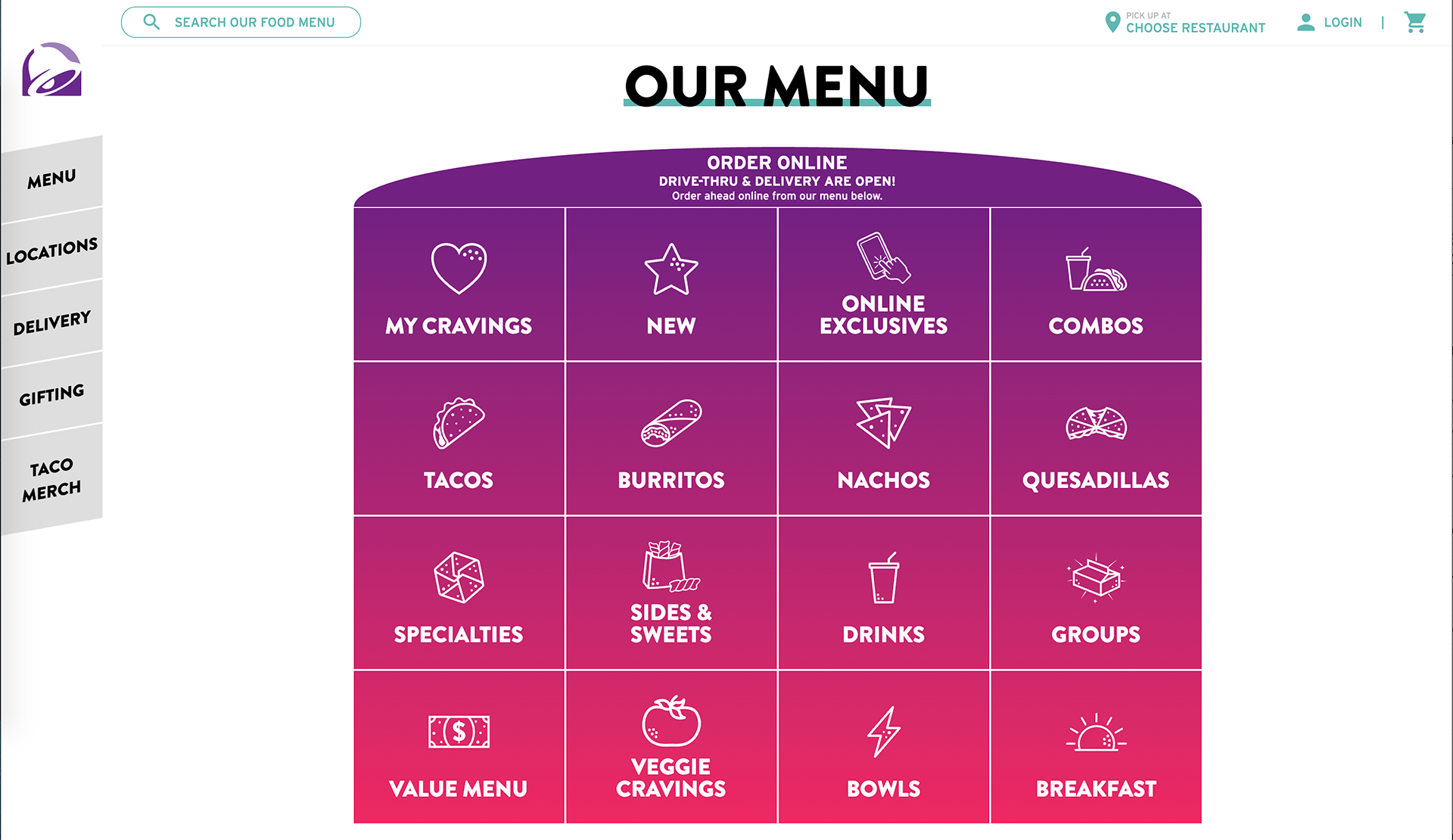
A screenshot of Taco bell's online ordering menu. Before ordering, however, you need to add your location first, which is hidden in the top right corner. If you change locations, your order disappears!
I had entered my order AND customized it, but then I realized I had the wrong restaurant selected in the top right. Once I selected the correct restaurant, I discovered that my order was NOT saved, because Taco Bells have different menus. So I gave up on my order!
During this process, I saw two usability issues that could be corrected using the OOUX process:
1. Make the menu items easier to find! In the current grid, menu items, combo items, party boxes, and selected filters al LOOK THE SAME and it takes some cognitive load to figure out what you want.
2. Make sure hungry people select a restaurant BEFORE creating an order, especially at a place like Taco Bell where you can do a lot of menu item customizing.
Approach: OOUX to the Rescue!
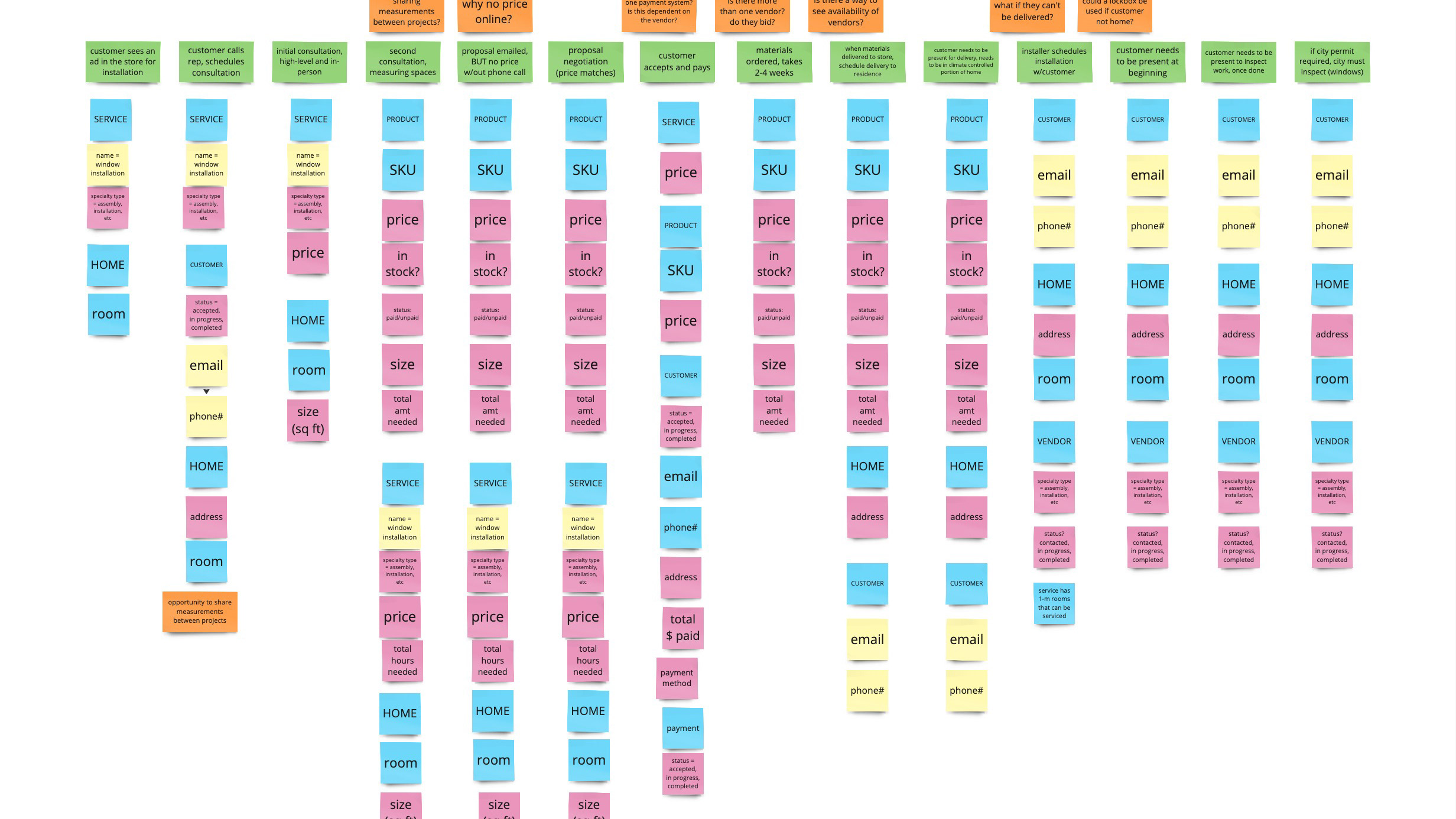
The first step in the OOUX process is discovering the nouns that show up over and over again in a company's materials such as FAQ pages, case studies, competitor sites, or anything else you can find. If you have user interview transcripts at your disposal, that would be ideal. Just from some time highlighting items from Taco Bell's FAQ page, these are the nouns that I found, with some affinity mapping for synonyms and proper names:
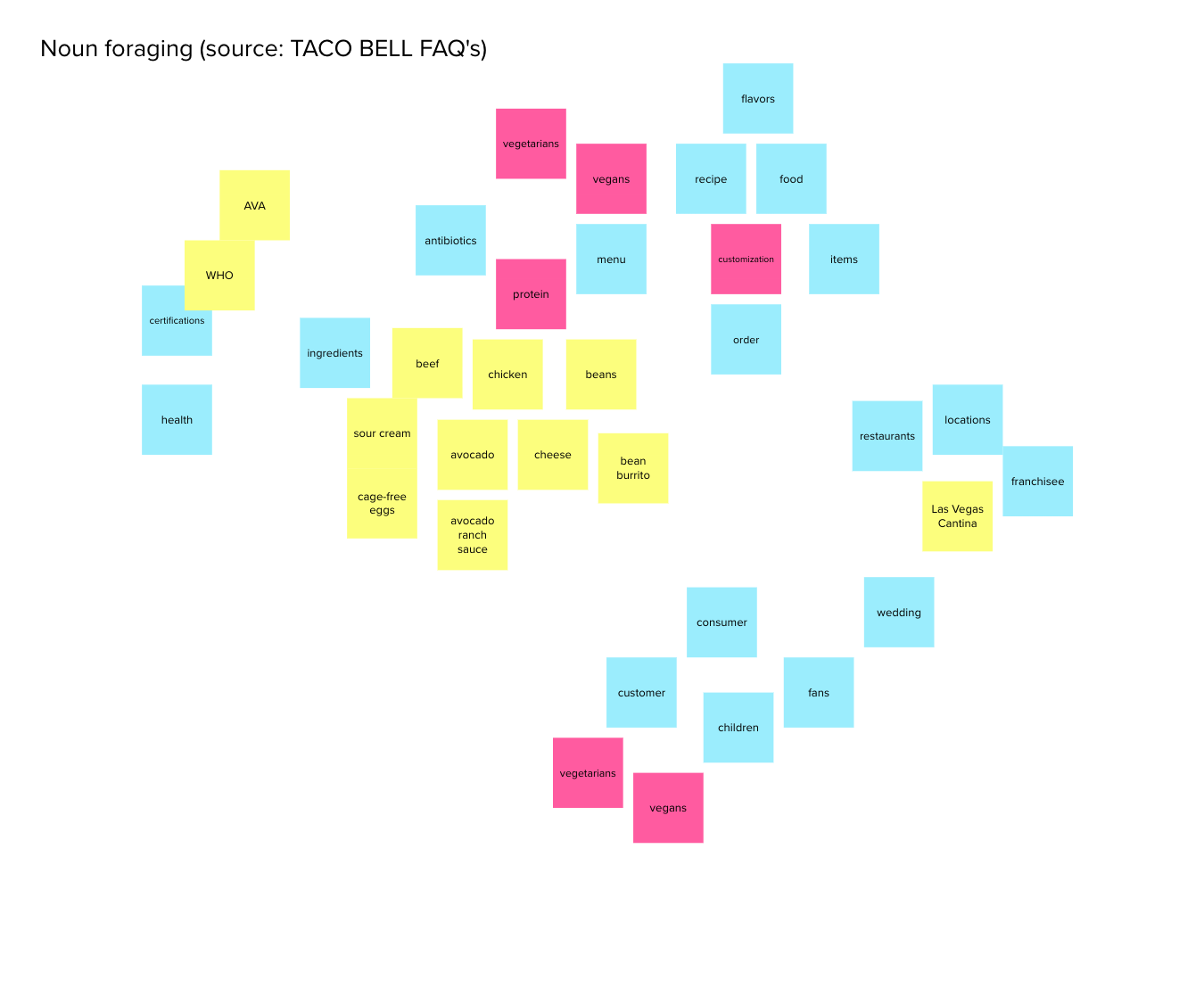
Affinity map of Taco Bell's FAQ page.
From this affinity mapping exercise, five objects emerged for me:
1. ORDER (a group of items)
2. ITEM (a group of ingredients)
3. INGREDIENT (because of the high amount of customizations on items)
4. RESTAURANT
5. FAN (I chose fan instead of a more generic "customer" because of the Taco Bell merch on the site, independent Taco Bell fan sites out there, the fact that you can get married in the Taco Bell Wedding Chapel in Las Vegas.)
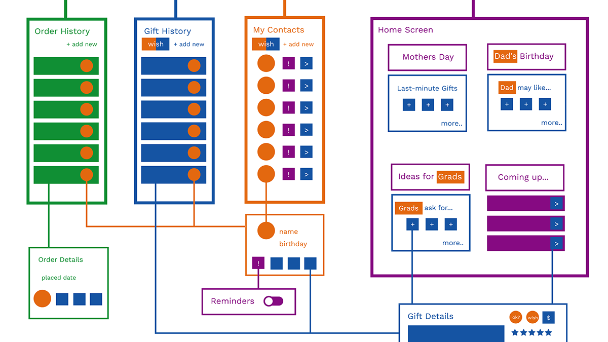
With my defined objects, I did an analysis of Taco Bell's online menu. I highlighted which of the menu items are objects (in blue) and which ones are actually filters (in pink). Based on this, I reorganized the menu based on, from left to right, menu items, groups of menu items, and two columns of filters.
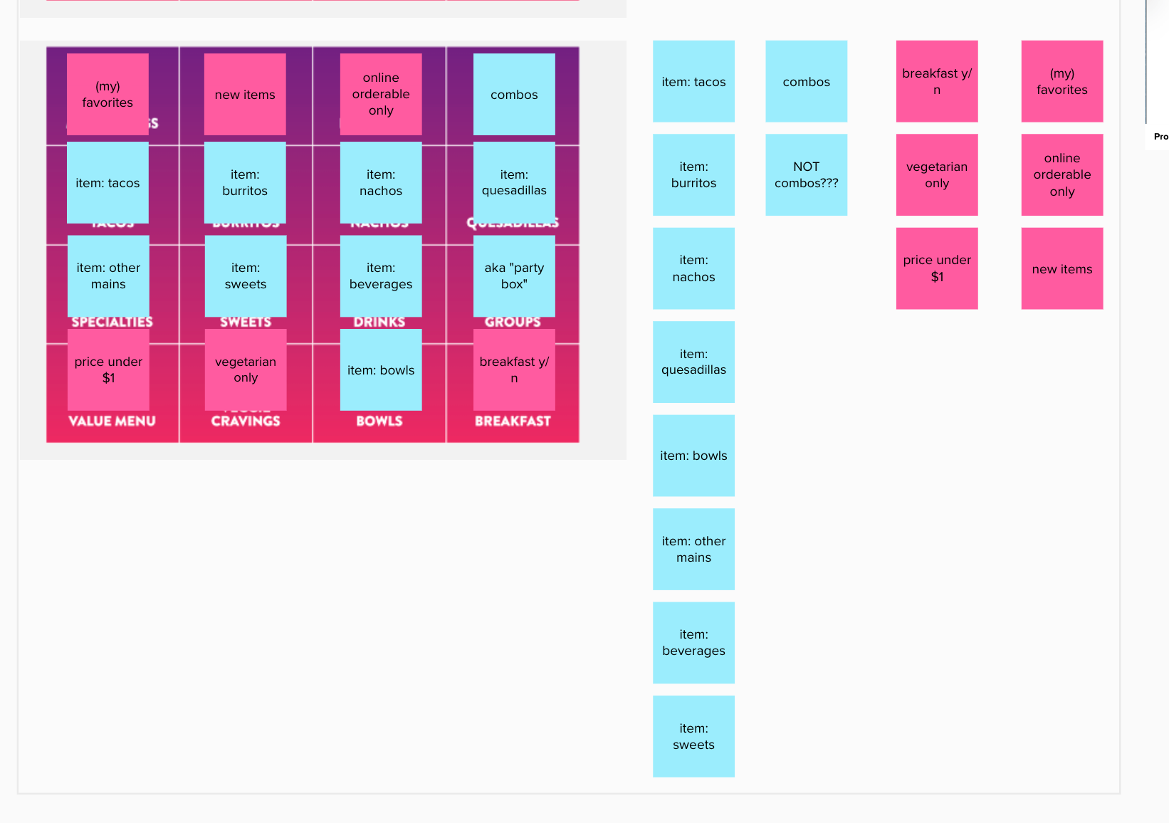
A screenshot of The Taco Bell Menu, analyzed by object vs. metadata. Blue stickies are objects, pink stickies are filters.
Solution:
I did two quick mockups based on the new information architecture for the menu. The first mock depicts the reorganized menu as well as the reorganized menu on the left:
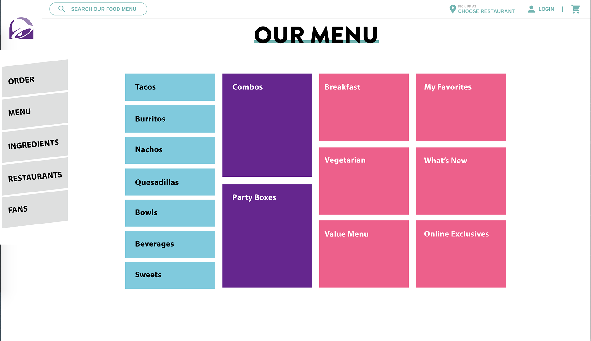
A mockup of a new menu for Taco Bell, organized by objects and metadata.
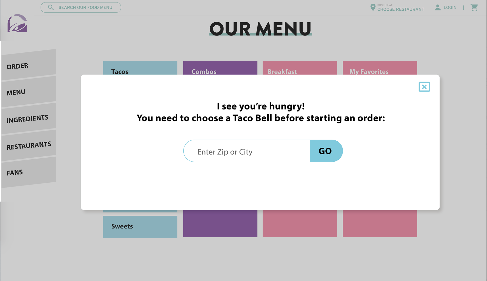
A mockup of an alert to appear before ordering to emphasize that you need to select a restaurant location BEFORE ordering!
I was able to demonstrate to my lunch-and-learn audience that using OOUX processes and principles does not have to take too much time, and can help designers and product teams make data-informed decisions to make customer's lives easier.