a Conceptual Add-on App for Amazon
I completed my first certification as an Object-Oriented UX (OOUX) Strategist in 2021, and this is my project for the class duration. Here, I go through the process of OOUX, step by step, in context.
I chose to do a project called GiftSync, which is an app that could interact with Amazon to track and recommend gifts for the important people in your life. The hypothesis is that the act of gift-giving, especially on a site as vast as Amazon, is a difficult process. On Amazon, you have to already know what you want to give and you have to time deliveries to dates on your own. An app that could combine potential recipient’s wishlists with Amazon’s vast data on products and reviews could be repurposed to help curate gifts.
Object Discovery:
To me, object oriented UX makes sense on two levels:
- First, it is a framework for organizing content that is based on how the human mind works, that is by objects (nouns).
- Second, it breaks down complexities by identifying the nouns (objects), verbs (actions), and adjectives (metadata) in a way that can be visualized and therefore quickly understood.
I did an exercise called noun foraging to start collecting possible objects (nouns) I would use to create an information architecture for this project. If I were doing this for a client, I would be noun foraging with user interview transcripts.
Since this is for a class and not a client, I did not have user interview transcripts that I would ordinarily use for a discovery process. I looked at seller forums on Etsy as well as highly-rated sites for gift baskets and group wine tastings. I wanted to look at group events that involved gift-giving, as the creative brief mentioned that the app could be used to purchase movies for group viewing.
Since this is for finding gifts on Amazon, I also looked at unboxing videos of gift baskets on YouTube to get an idea of things about how the packaging of a gift can impact a recipient’s experience.
All of these sources gave me a good affinity map of nouns to get an idea of what the objects would be for such an app: ORDER, RECIPIENT, RETAILER, OCCASION, and GIFT.
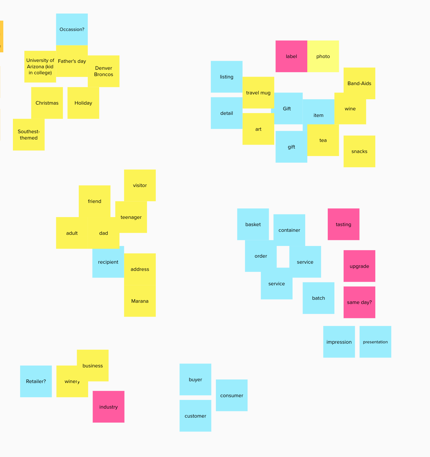
My affinity map, done in Miro. I grouped related terms to find my system's objects
Calls-to-Action and Role Brainstorming:
Once the objects/nouns were identified, I began to define the verbs, or the actions, that users would use to interact with objects. In order to get good actions, I created another matrix that is organized by the different user roles in the app. I narrowed this down to three:
- Gift buyer
- Gift receiver, can interact with things like downloading (if necessary) and, just in case, returns.
- Admin/retailers - would coordinate shipping and promotions. They make sure that gifts are tagged properly so that buyers can find gifts.
Metadata Brainstorming:
The next step after gathering nouns and verbs is to gather adjectives, or the metadata attributes, that users would use to navigate and sort through objects.
For attributes, I did some hunting on the Harry and David website to discover what's important to gift basket buyers. For example, I added filters to special diets (vegan, gluten-free, etc.) and, for now, I'm keeping those in the same area, probably checkboxes.
Since there are going to be the most instances for gifts, that object has the most attributes.
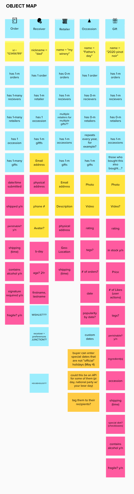
A Nested Object Matrix (NOM), or an object inventory
Now that I had a good map of the “points of interest” for my app concept, I jumped in to brainstorming on Calls-to-action (CTAs). As a part of this exercise, I imagined three roles who would be using this app and put them into a spreadsheet:
- Gift buyer. Note: gift buyer is NOT an object as buyers are not manipulating info on themselves in this app; they are using their Amazon login credentials, preferences, etc.
- Gift receivers can interact with things like downloading (if necessary) and, just in case, returns.
- Admins/retailers - would coordinate shipping and promotions. They make sure that gifts are tagged properly so that buyers can find gifts.
My Google Sheet link is here
Project Scoping:
I put all of my objects and attributes into a Trello board in order to scope out the work. OK, this one was a journey.... and here is a link to the whole thing and clipped below:
This exercise shaped:
- What is needed for a Minimum Viable Product (MVP)
- What can go in later as a Phase 1
- What can go in a Phase 2
The two big changes I made to my board were:
1. Downgrading the RETAILER object I had, at least for phase 1. I'd have to do some research into the relationships between Amazon and their retailers, as I had originally intended for buyers to be able to favorite retailers. I downgraded retailer as metadata for the gift object (i.e. "available from these retailers")
2. I combined my junction object that connected gift attributes for dietary considerations to the recipient's preferences. I had separated out dietary restrictions (e.g. vegetarian), religious preferences (e.g. kosher or halal), and custom preferences (e.g. doesn't like horror movies) originally.
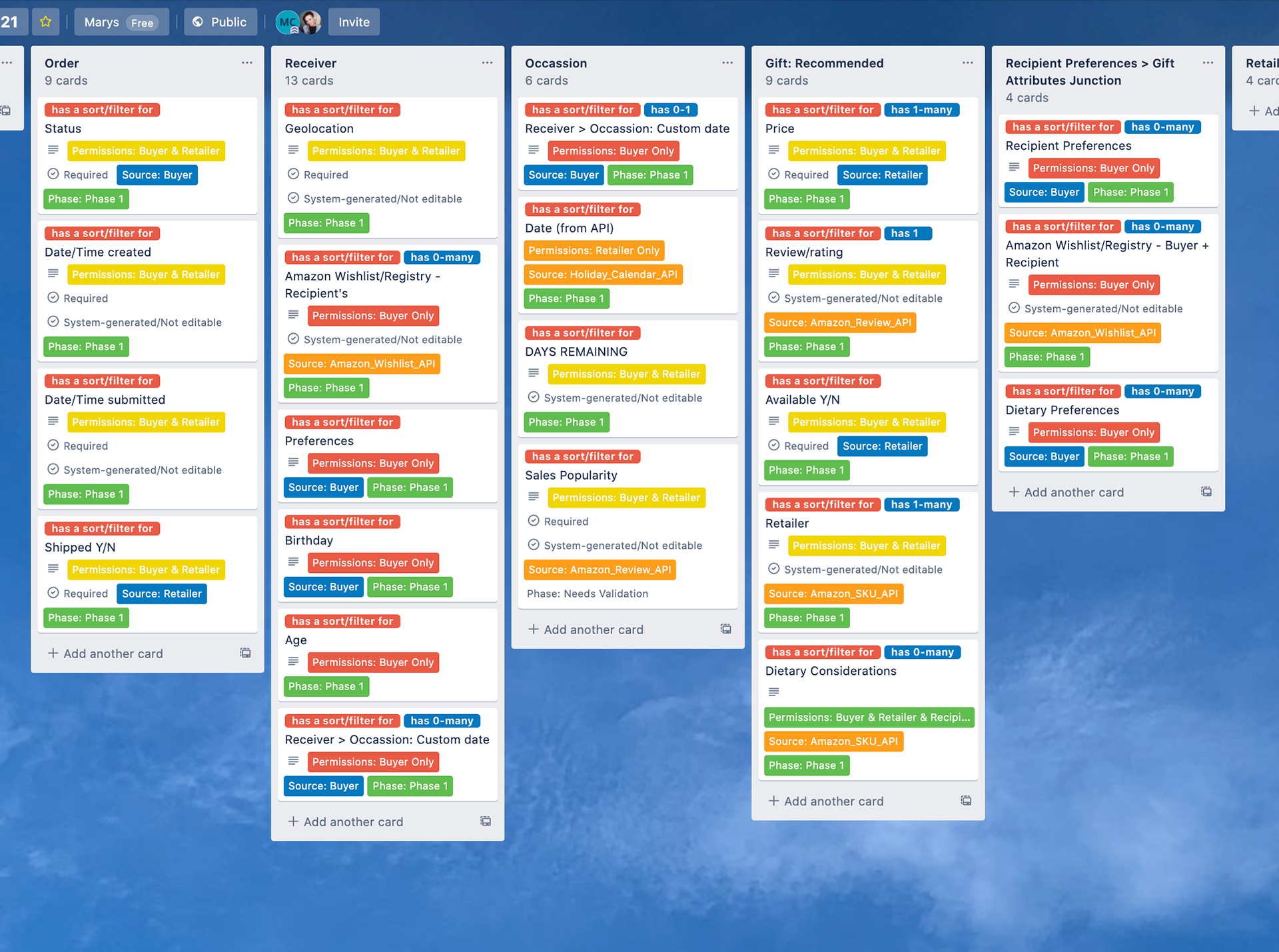
Trello screenshot that visualizes the scope of this project in columns, by object. Cards are tagged for phases and sources.
For Phase 1, I combined dietary and religious preferences into one nested object. I did this because I now saw this would work better as a list of checkboxes. Custom preferences would function, by contrast, as a list of keywords and would take more time to develop and test, so that is a good candidate for an enhancement.
As part of this exercise, I created a roadmap: My Google Sheet link is here.
Downgrading the Retailer object was a big help in phasing my CTA's. I also noticed that the Amazon Wishlists that I've had in the back of my mind for a few weeks managed to bust out and became a more critical part of Phase 1!
Navigation Flow:
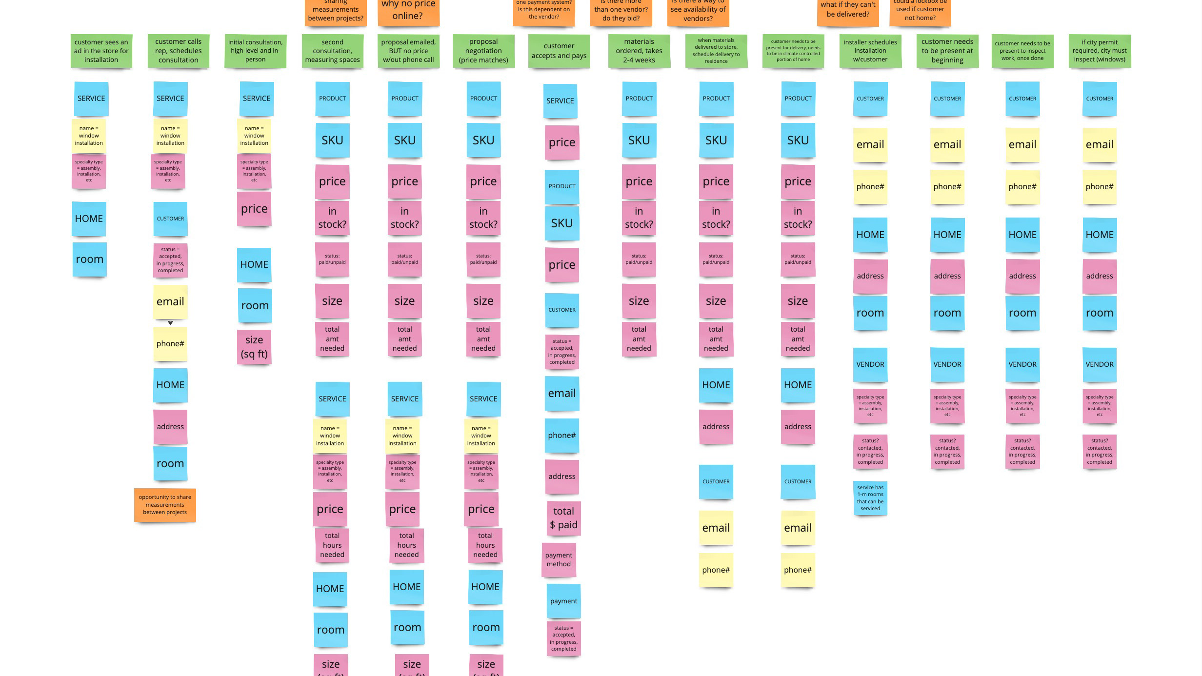
Now that I had everything identified and scoped, it was time to start working on my navigation. I'm most comfortable with Illustrator, so here is the diagram I ended up digitizing:
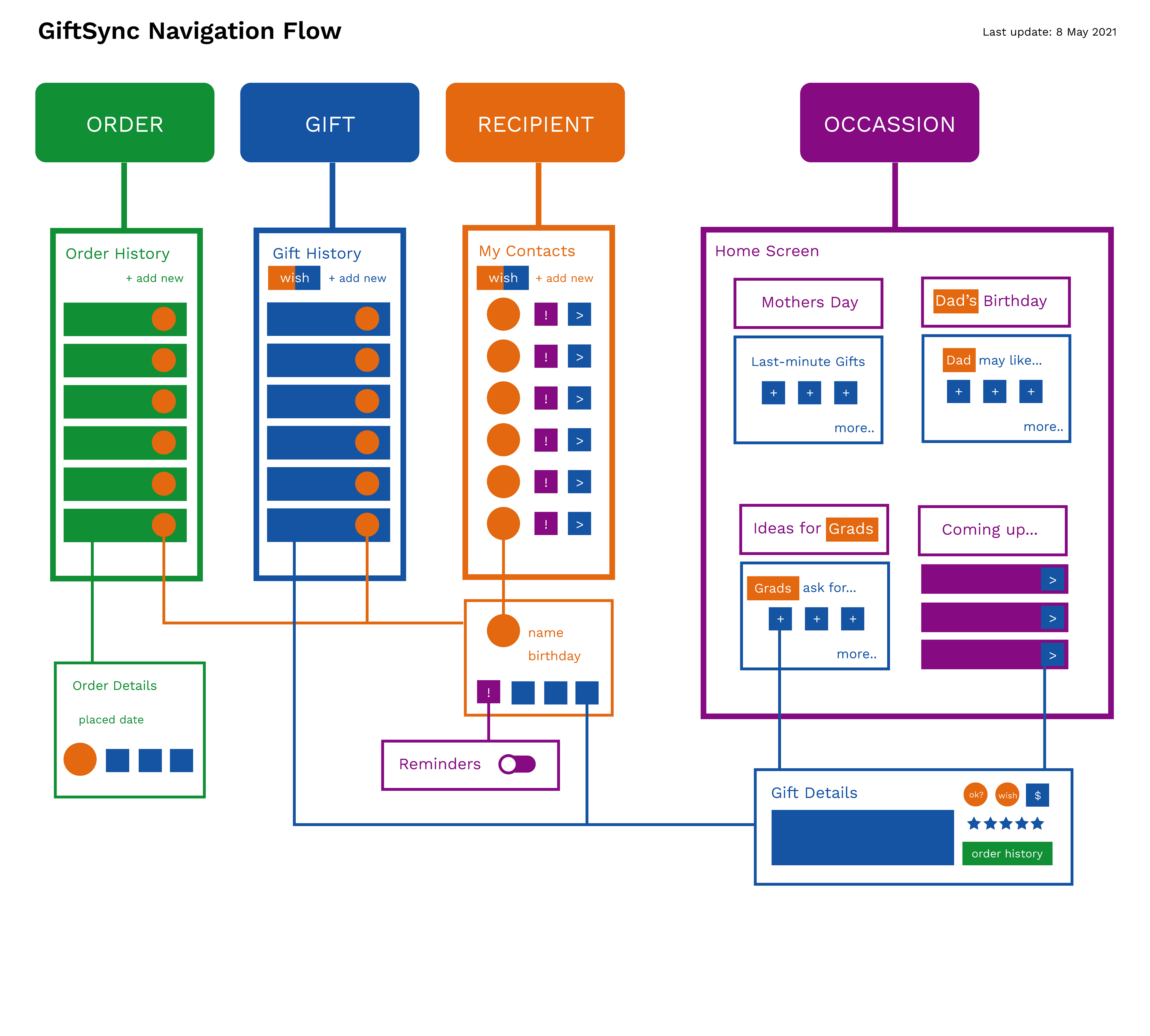
A flowchart that has GiftSync's system objects mapped out to show how relationships would be visualized for the app.
I originally sketched out a basic list for all four of my objects. I thought about it some more and it made sense to me to try an instance-based homescreen experience, with instances of occasions. I structured it in a time-sensitive order:
1. Mothers' Day - coming up, so last-minute gift ideas. Sidenote: recently I got an email asking me if I wanted to see Mothers day emails because they recognize that Mothers Day is a difficult holiday for some (that was so considerate!).
2. Dad's birthday - coming up, but the buyer has more time to decide for an individual. It also hints that there is some gift history and wishlisting ahead...
3. Ideas for Grads - coming up, time to decide, but for maybe a group of people. This hints at some AI based on things that graduates like.
4. Coming up - a list of occasions with gift recommendations. This could be a list or could be a calendar?
I also came up with a concept while connecting this navigation flow to schedule gift orders ahead of time, for people who give the same gift to someone every year but also for people who want to schedule a gift to be sent automatically, in time to be close to specific dates.
Sketching and Prototyping:
A massive benefit of the Object-oriented UX process is that I did all of this prework to make sure that I had a good system in place before designing screens. The nav flow was super helpful in particular, as it gave me a map of sorts for the cross-linking opportunities that I defined. In the past, I would not have considered cross-linking as a priority, I would think of that sort of thing as an enhancement not as baked-in.
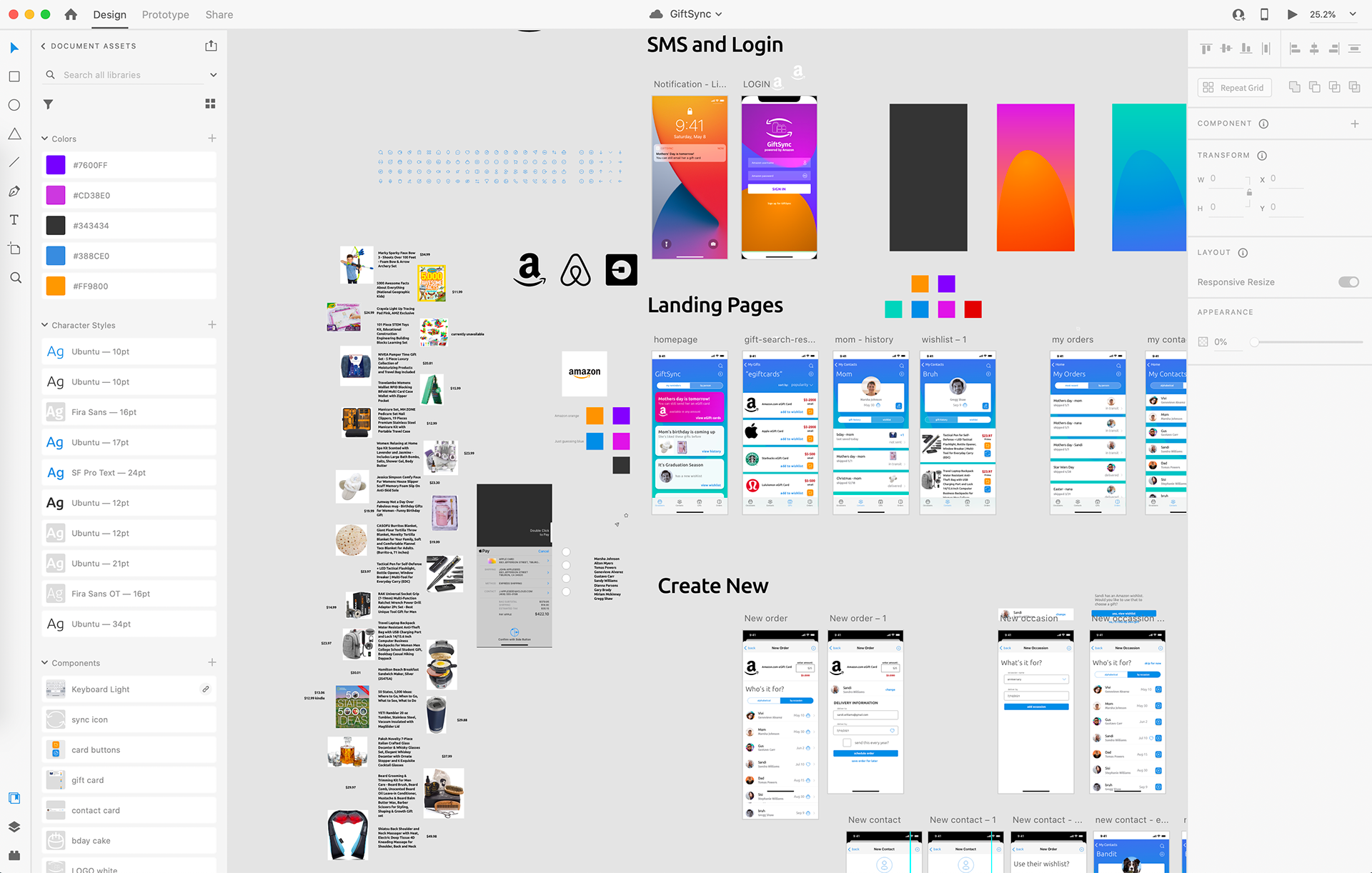
A screenshot of the GiftSync prototype. I used real Amazon product data and styles to create the concept.
Lessons Learned:
Overall, OOUX for me is a new and exciting way to work after more than 10 years focused exclusively on user-centered designs and experiences. As a UX Designer, I work every day with complicated systems. Many times, the full complexity and the questions surrounding it are avoided, which means that Discovery phases are incomplete and come back to create more work for designers much later in the process when things can be much harder and more expensive to change. Addressing complexity at the outset of a project may take more time upfront, but like many things, the best way forward is to go through it! Product teams can communicate much better and products are much better off.
The prototype for GiftSync is still a work-in-progress, but here is the XD link, feel free to comment and follow - thanks for reading this far!