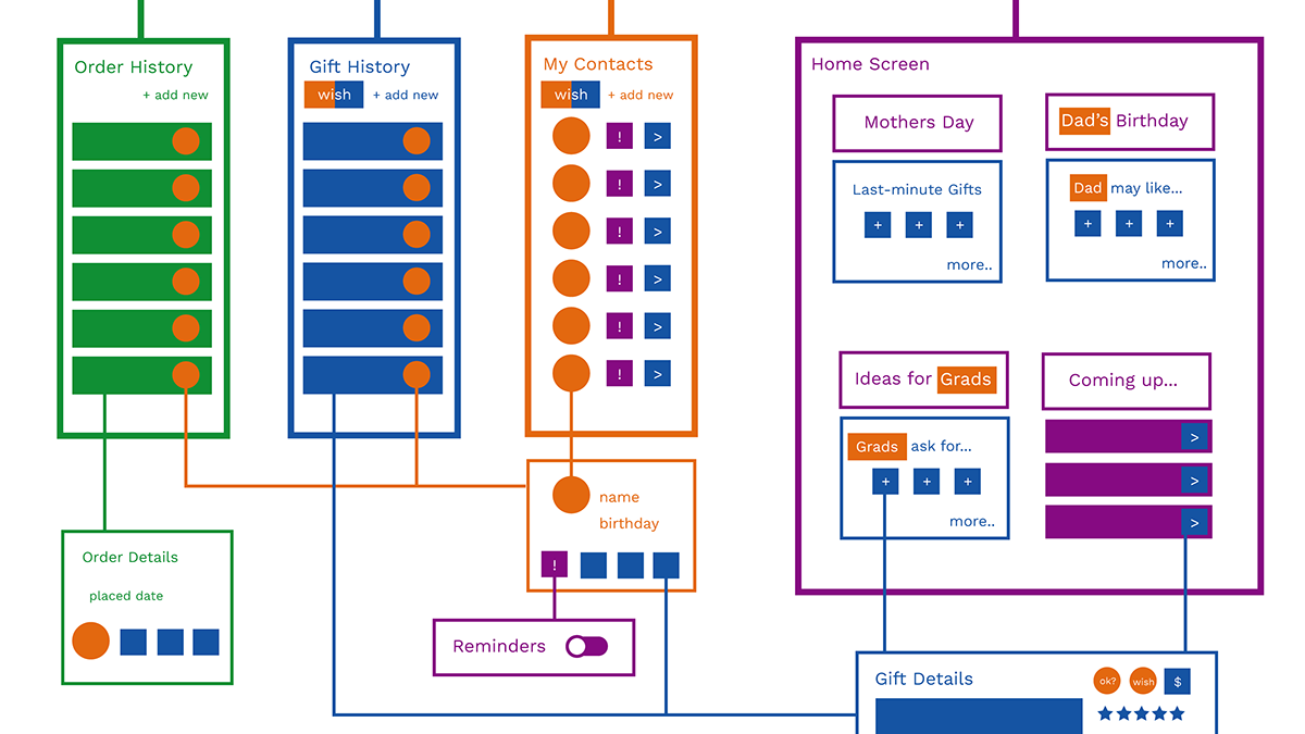
A design thinking project completed as part of my certificate in Managing Innovation and Design Thinking, HEC Paris, June 2020
Why does design education need to be reimagined?
1. Assumptions that cost of entry into the field is very high discourages would-be designers from pursuing the field. This has led to homogeneity among design professionals and uniformity in their work.
2. Design education teaches people how to give and receive criticism, which is an important skill but is not commonly taught or practiced in other disciplines.
3. Depending on how people were raised and/or conditioned, some people believe that critiquing or questioning anyone is rude.
4. Open communication is critical to design and innovation, but many are not shown how these skills work in a safe, collaborative environment. This leads to anxiety among designers, bullying among clients, and lack of innovation in companies.
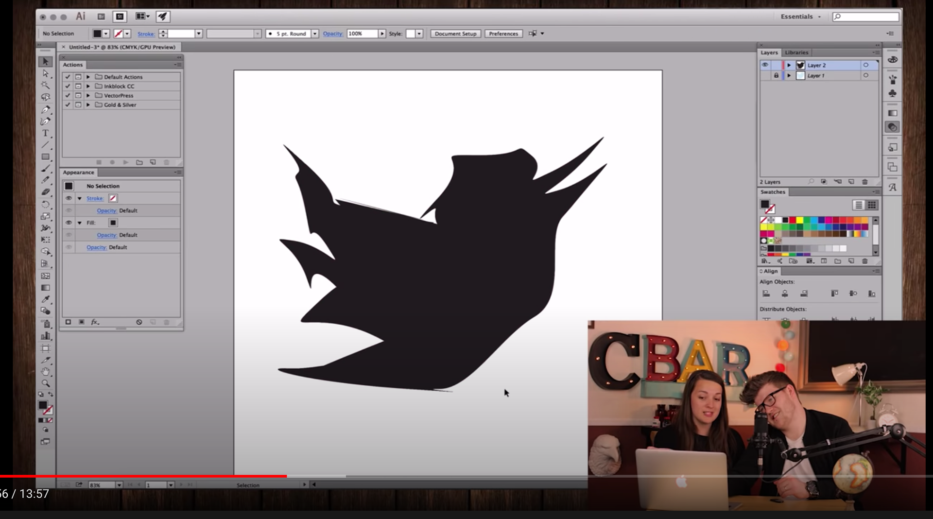
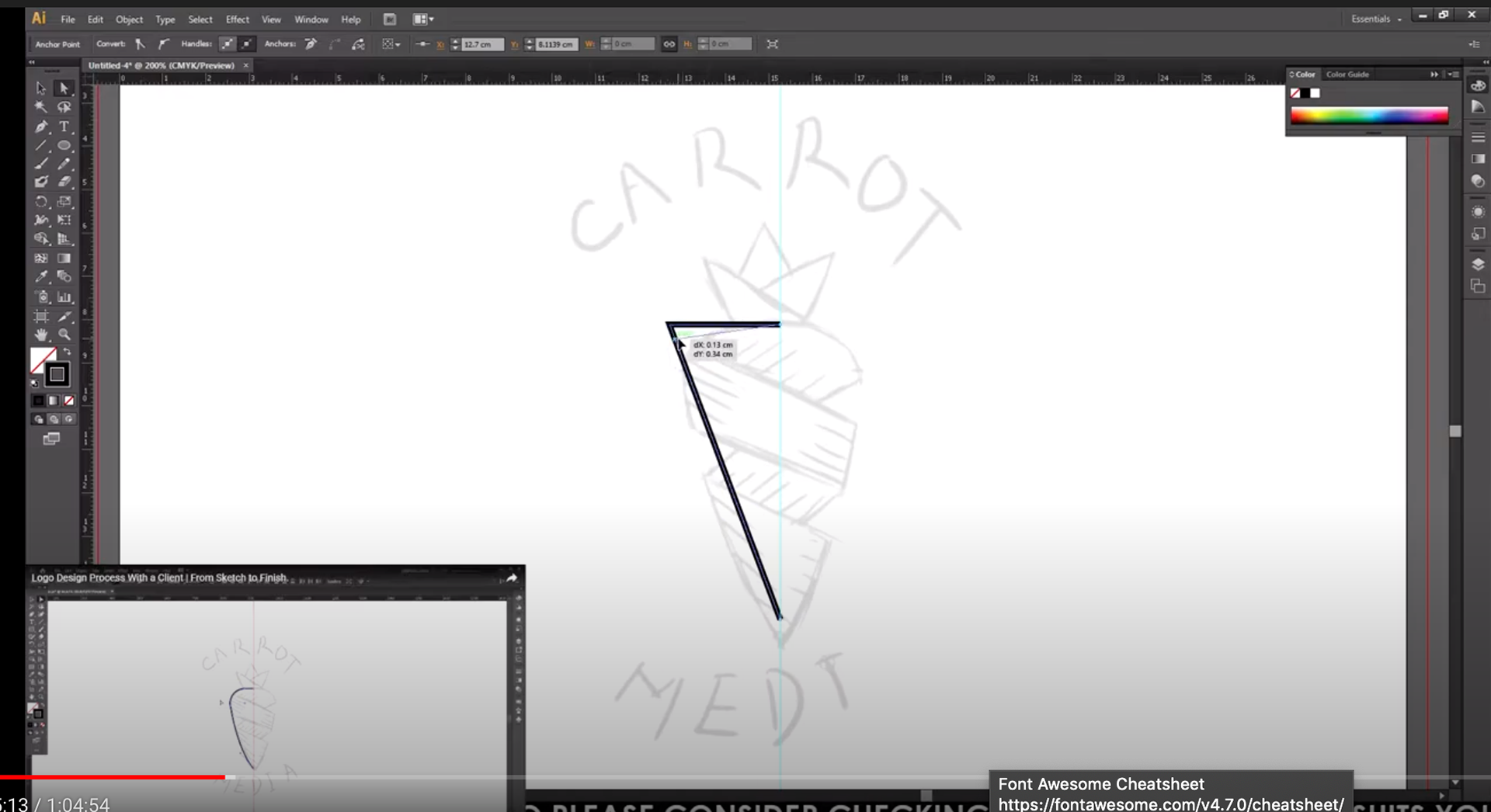
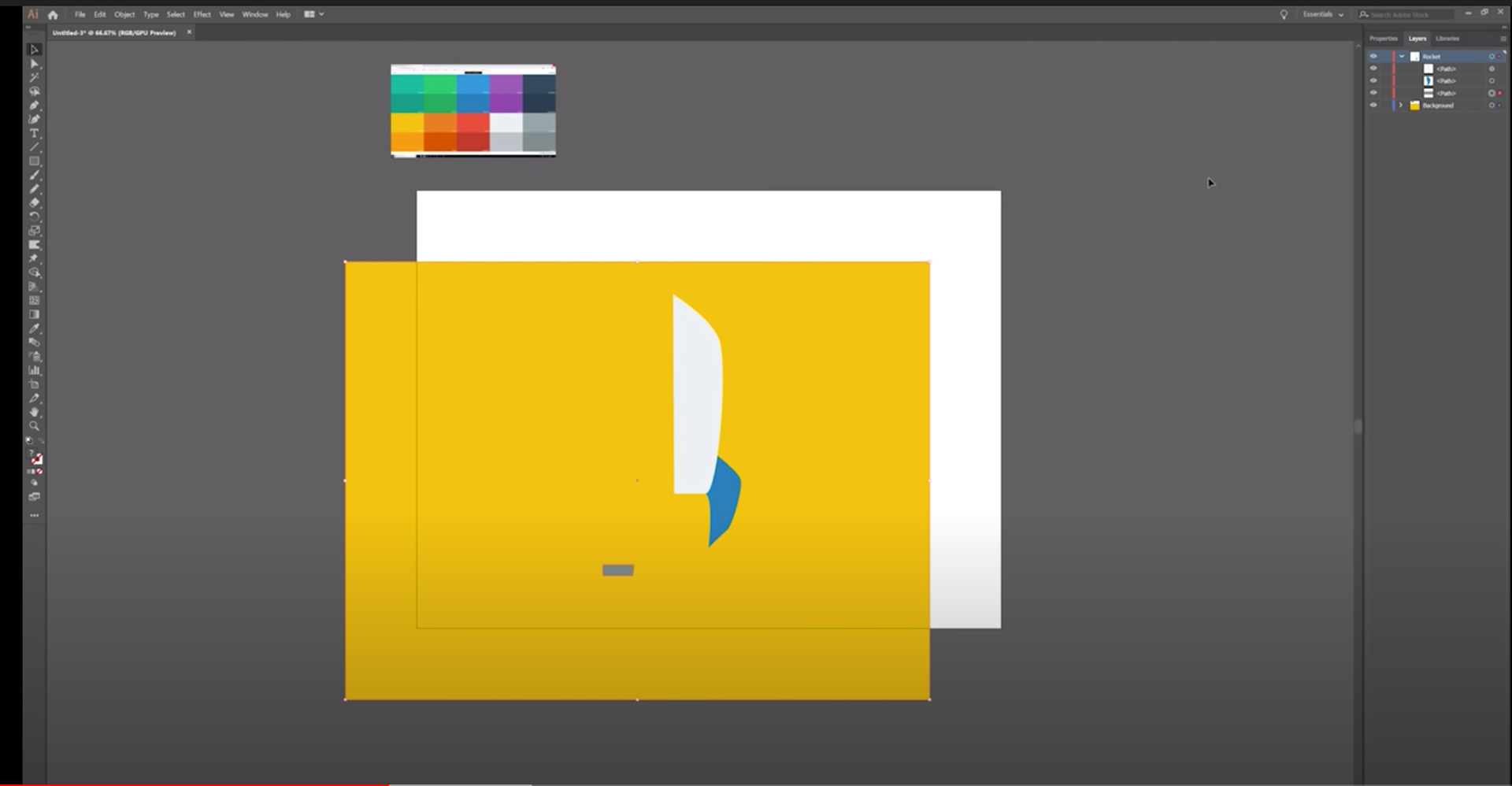
Screenshots from observations made while viewing YouTube videos of people with various design skills using Adobe Illustrator for the first time
I started observing with a hypothesis that learning digital illustration itself is a hindrance for aspiring illustrators. What I found by watching these "unboxing illustrator" videos is that the tool may be difficult, but because a lot of aspiring illustrators are struggling on their own, it is even more difficult for them to judge when they are getting better at illustrator.
Storyboard depicting a user journey of an aspiring artist using Adobe Illustrator for the first time. Artifact done in Mural.
Persona depicting an aspiring graphic designer. Artifact done in Mural.
Major pain points:
1) Self-taught designers often work in silos and therefore don’t know if they are improving. Feedback they get from their friends and social media involves “that looks great” but nothing truly constructive.
2) Main source of learning is Youtube and some tutorials are better than others. These tutorials teach software but not the problem solving and accepting feedback type of soft skills that are crucial to learning and surviving as a working graphic designer.
3) Formal design learning is EXPENSIVE which has led to a lack of cultural diversity within major design studios. Diversity of thought is essential as part of the brainstorming process.
HMW Question for prototyping
HMW help graphic designers learn to advocate for themselves so that they can prosper by being better understood?
Prototype 1
Hypothesis: graphic designers could track their progress and build confidence by seeing daily statistics on their design activities on a watch app.
Results: testers did not see why this would be valuable. They really wanted to see more visual content.
Hypothesis not confirmed.



Screens from Prototype 1. Prototype done using AdobeXD.
Prototype 2:
Hypothesis: graphic designers could give feedback anonymously on others users and in return would get feedback from other users.
Results: the main activity, giving feedback to get feedback, was not apparent. Testers also wanted to see the thumbs-down comments early in the process: they want honesty.
Hypothesis partially confirmed.
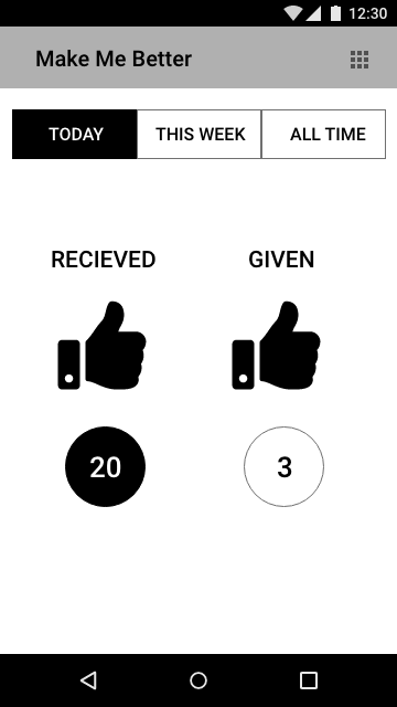
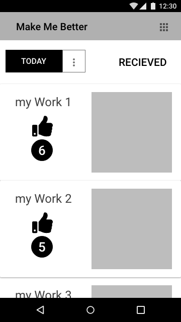
Screens from Prototype 2. Prototype done using Adobe XD.
Prototype 3:
Phone App: Design/Client Matcher (will open in new window)
Hypothesis: graphic designers could find work by matching their preferences with potential clients.
Results: the style picker was easy to use, users wanted more details on the communication aspects, i.e. won’t contact a client that has already been contacted.
Hypothesis partially confirmed.
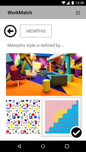
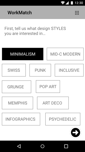
Screens from prototype 3. Prototype done using Adobe XD.
Lessons Learned from Prototypes
I decided to combine the two phone applications into a single prototype. I got some positive feedback on both prototypes as far as general functionality, but in both cases users did not get the application’s purpose right away.
To address this, I included a more detailed onboarding process in the following storyboard.
Storyboard synthesis from prototype experiments. Artifact done using Mural.
Taking a Design Thinking approach allowed me to get out of my own head and do a deep dive into an issue that I have been passionate about for a long time.
As a design professional, I have observed, many times, stakeholders who firmly believed that they were the users and created products that did not resonate with actual users. Using the Design Thinking processes, I was able to see that I fell into the same biases when I tried to create solutions for my problem.
In the past, I had thought that people wanted primarily to learn design tools, but this exercise has showed me a real need to learn soft skills on one’s own in order to become a successful designer. The research process that informed and redefined my problem showed me an opportunity in creating a social app where designers could learn how to use feedback in a safe way, with no yelling or crying involved.


